Pandas uses MatPlotLib to do its visualization but simplifies many common issues found with MatPlotLib. In most cases, Pandas meets graphing needs. However, if deep customizations are needed, it is necessary to use MatPlotLib. See pandas.pydata.org or matplotlib.org for more detailed information on Pandas plotting.
The query and table below are used for reference points on all graphs displayed in this document.
Query:
dataframe = get_hits('()diabetes', store='Records', limit=5, fields='extract.patient_id, extract.age,  extract.patient_full_name, extract.weight_standard')
print(dataframe)
Response:
| extract.age | extract.patient_full_name | extract.patient_id | extract.weight_standard | |
| 0 | 43 | Gail Hill | 94451 | 170.0 |
| 1 | 43 | Gail Hill | 94451 | 170.0 |
| 2 | 36 | Rhoda Sweet | 92830 | 220.5 |
| 3 | 13 | Jescie Lyons | 92721 | 138.0 |
| 4 | 70 | Lyle Cash | 92750 | 257.0 |
Displaying Graphs
The information in this document is valid but intended for more advanced users. Using output_plot() along with the axis object (also called ax) is less complicated.
The primary function of Pandas is .plot().
dataframe.plot()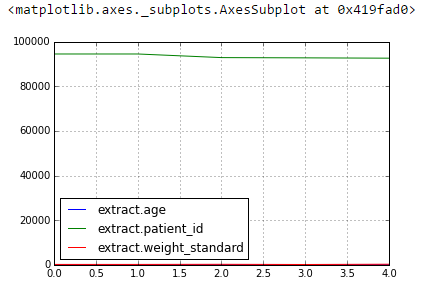
In this state, the graph is not very useful. By defining an x and y axis, it is possible to specify the information that appears on the table and on which axis.
dataframe.plot(x='extract.age', y='extract.weight_standard')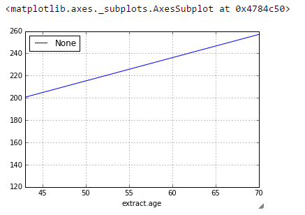
It is possible to choose which type of graph to display when using the kind parameter. Some common types of graphs are bar, line, scatter, barh and hist.
dataframe.plot(x='extract.age', y='extract.weight_standard', kind='scatter')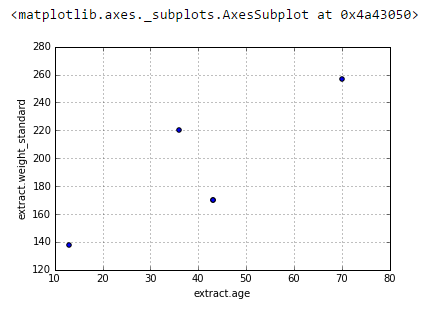
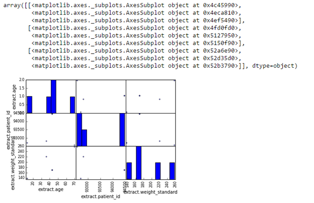
from pandas.tools.plotting import scatter_matrix
scatter_matrix(dataframe)